-
Solid Park
Solid Park needed a new logotype and graphic identity. The symbol indicates stability, strength and experience. Solid Park is an IT organization that works in business areas such as infrastructure, systems development, systems maintenance and operations.

-
Little Logo Pond
Little Logo Pond is a collection of mixed logos and symbols designed over the years and become more or less used.
-
Karl Hedin
AB Karl Hedin, a family-owned sawmill, packaging and commercial group, wanted a new approach for their business. With a mission to create a chain where 100 percent of the tree is taken to be from the plant in the forest to the plank in the timber yard. Co-work with Creape.
-
-
Europafilter
Europafilter a pioneer company in Unique Oil Cleaning System Needed a new identity and logotype. The simple idea is to show how a drop is clean.

-
Aroseken
Renew the visual identity on the web for one of the oldest local construction companies in Västerås.
⇒ Visit website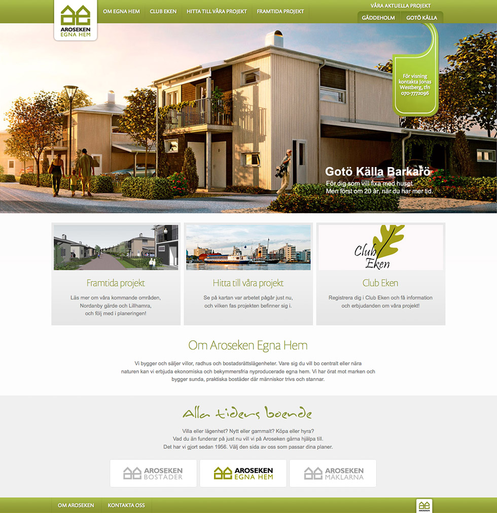
-
Smartshake
SmartShake is a relatively new company that designs and manufactures shakers with unique advantages. The company has since been a success, and in 2010 SmartShake introduced the product in the U.S. market. The mission were a new responsive website in a more minimalist and modern style where it will be good space for their products.
⇒ Visit website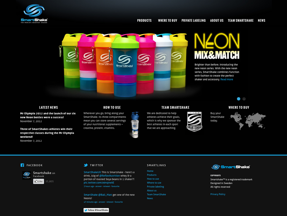
-
Interjakt
Interjakt is the largest chain of department stores of hunting in Sweden. They consist of 19 independent stores from Sjöbo in the south to Kiruna in the north. The challenge is to get the webshop to work in different levels down to a local level. Co-work with Oddcorn.
⇒ Visit website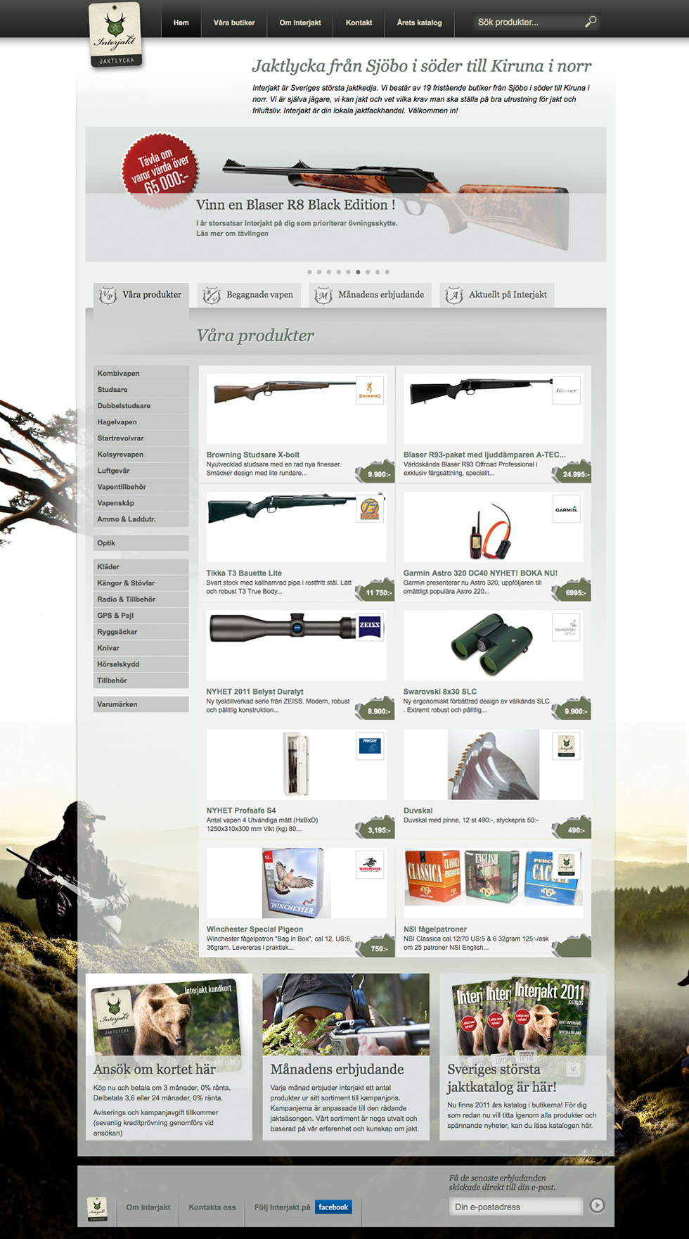
-
Läkarmissionen
Since 1958 Läkarmissionen worked to change the future for vulnerable people. Mission with their new website was to simplify the structure and give the page a modern style.
⇒ Visit website
-
ABB
The campaign site a "lifecycle" symbolized ABB's energy-efficient products site that served as a hub for all communication that drew visitors to ABB´s trade show, from the invitations, through the fair stand to follow-up activities. Here the bike played a key role. Co-work with Creape.
-
level recruitment
A new graphic and visual style for Level Recruitment an innovative company within the recruitment business.
⇒ Visit website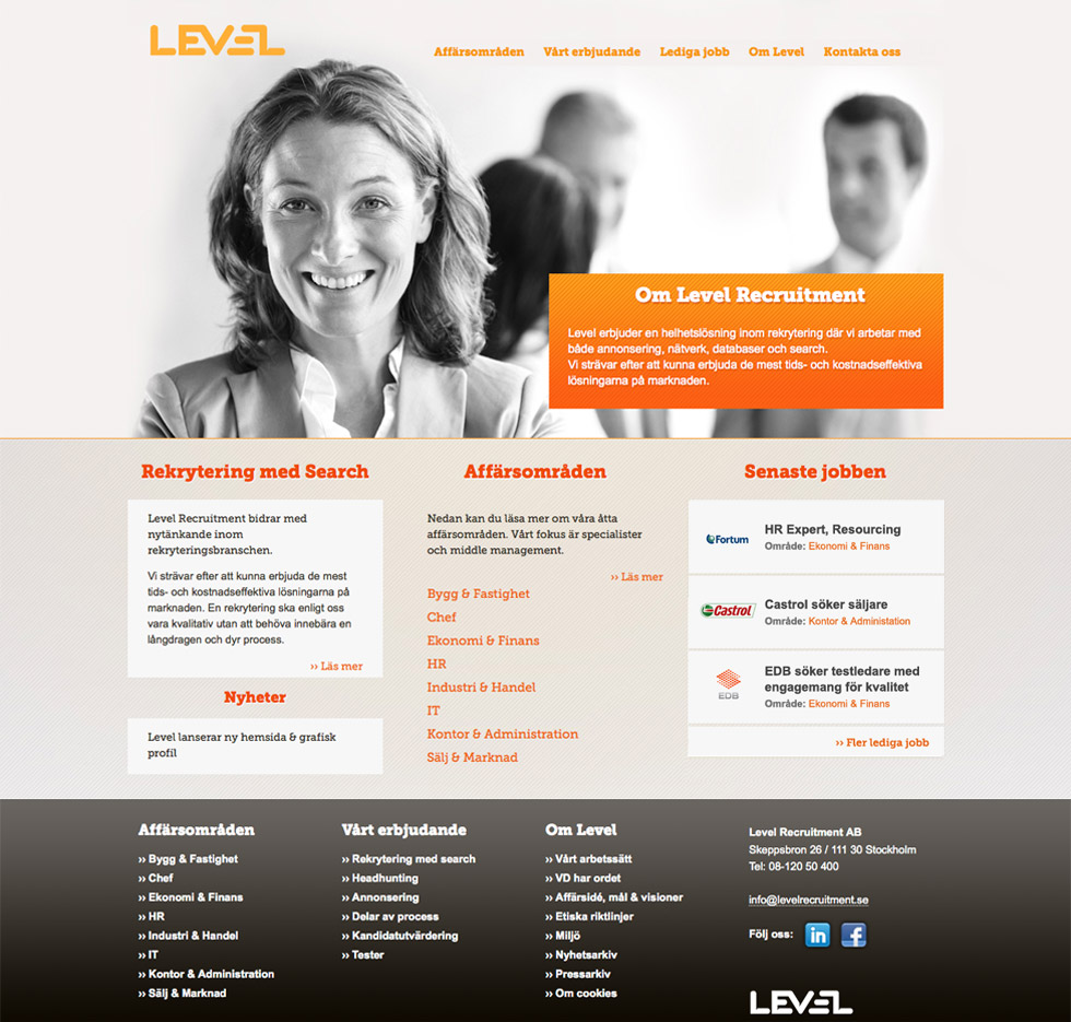
-
Swedish Ski Assoiciation
An attractive design combined with good usability were the keywords when the Swedish Ski Association would produce their new website.
⇒ Visit website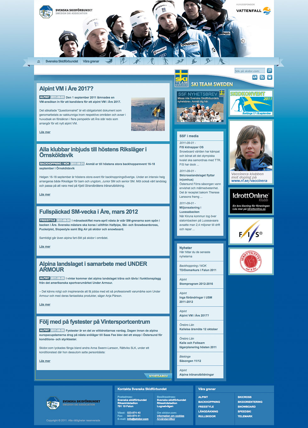
-
Mälarenergi
An implementation of a new design on an old skin. The challenge was to get the right feeling digitally from a new print-oriented graphic manual.
⇒ Visit website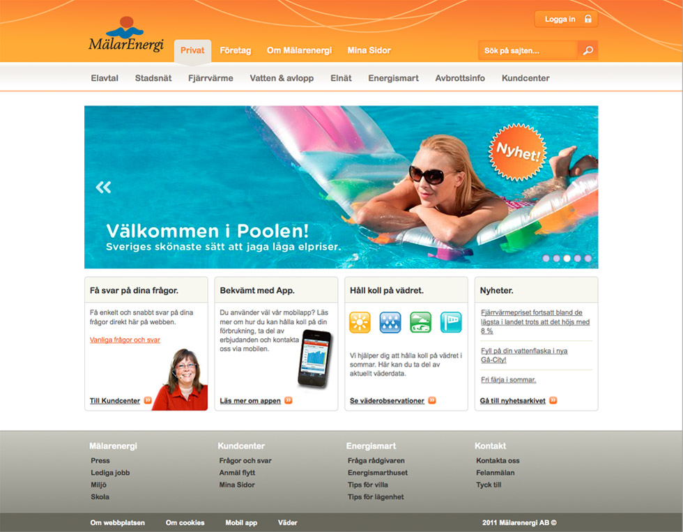
-
Mälarakademin
Took over and improved a theme for an academy in Västerås. An original and selling website was the result.
⇒ Visit website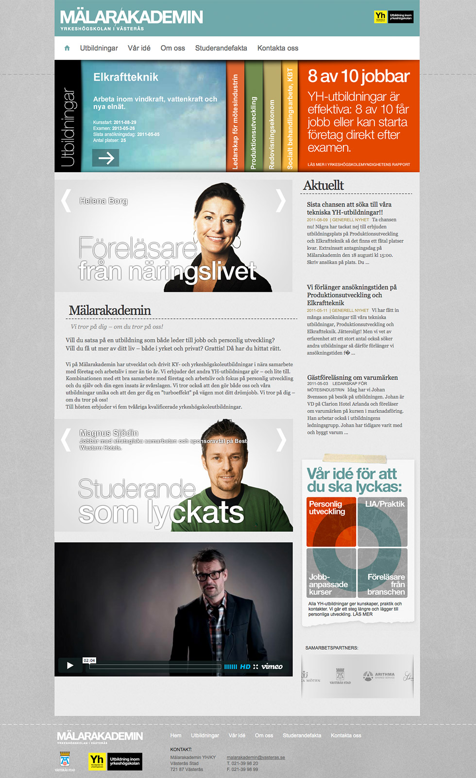
-
City Mission Band
I designed the an album cover to a band whose members are consists of people that were or living on the streets. The project is to collect money for the City Mission Church to aid the homeless.
⇒ Visit website

